How to Politicize a Tornado
The tragic damage wrecked by this past weekend's tornadoes has quickly become politicized
Media outlets across the fruited plain took the opportunity of devastating tornadoes in Tennessee, Illinois, Indiana, and Kentucky to shill the goo-goo-ga-ga idea that the "climate crisis" may be making tornadoes worse. It's become de rigueur for the press to occasion each calamity with a grand coronation of some still greater calamity that coincidentally falls under the umbrella of an adjacent social or political movement, so we shouldn't be that surprised that before the rubble has cleared and the family losses processed, outlets across the fruited plain cry "Politics!" to win some votes.
In our local media, Axios Nashville shared the cute graphic below that is supposed to make the case that the climate crisis is at the root of this past weekend's tornadoes, but actually says next to nothing about anything. I guess without God and Science, you have Climate Change and poorly rendered data art.
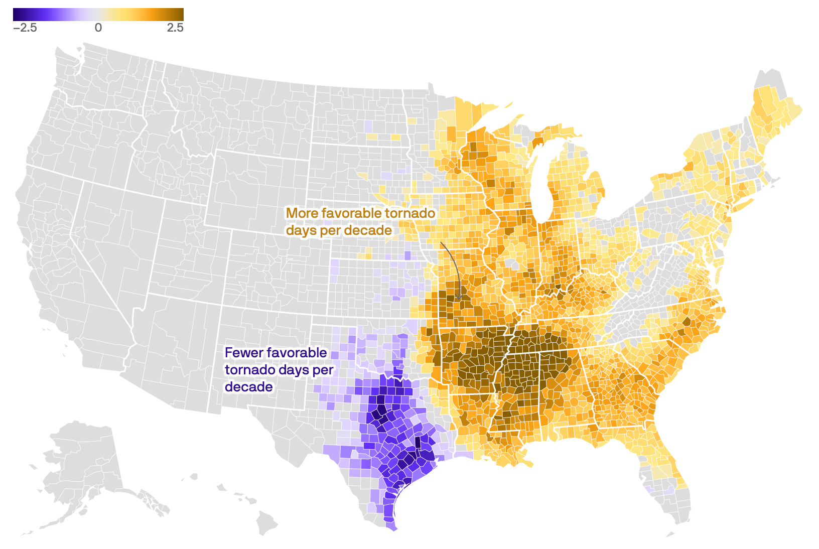
The graphic shows the number of "favorable days per decade" since 1979 in which a tornado is likely to happen. In West Tennessee, the graphic shows that over the past decade, there have been an additional 2.5 days per decade since 1979 wherein a tornado could occur. The graphic says nothing about damage from tornadoes or the actual number of tornadoes. That's probably because the danger posed by tornadoes has never been less threatening, and to shed light on that point would undermine the climate change narrative the Axios corporate office wants its local apparatchiks to push.
Cross-referencing the map with a map displaying fatalities since 1950 on a county level, you will see that "favorable days" (whatever that means) seem to have little, if any, correlation with injuries and deaths as a result of tornadoes. There's not even a correlation between the number of tornadoes in an area and casualties resulting from them. So, what does that map show us? Absolutely nothing. In the push to "politicize" the tornadoes, it's likely the map surfaced as the only intelligent seeming graphic that showed something getting worse. Dark color on map, bad. High number on map, bad. Ergo facto, climate crisis causes tornadoes. Print it! We have a deadline!
What you're really looking at is the Southern part of the well-documented Tornado Alley which has consistently threatened people within its boundaries since settlers made their homes there, and before that, when Indians roamed the plains. In one collection of worst tornadoes in Tennessee's history, the list is divided into those with 25 of more deaths prior to 1953 and those with 5 or more thereafter. Due in part to more advanced warning systems and advanced construction methods, the death tolls and damage from tornadoes have plummetted across the US since the end of WWI.
Nonetheless, Biden has urged the EPA to investigate the role of the climate crisis in causing deadly tornadoes. Someone draw the curtain already.